Prose
Editorial typography primitives for launch notes, essays, and product storytelling.
Copy a concise page brief or the full MDX source without digging through the docs shell.
Editorial primitive
Product writing can match the interface.
The prose layer uses the same typography rules and spacing contracts as the product UI.
That makes launch notes, case studies, and longform docs feel like part of the same system.
The prose primitives turn longform into a first-class product surface. They establish consistent article width, title rhythm, section spacing, figures, and resource lists so journal entries, launch notes, and extended docs pages feel authored within the same system as the UI. The docs examples also use the theme-derived surface scale so longform blocks can separate themselves from nearby controls without drifting off palette.
Installation
Purchase access, then open /account/install to issue a registry token.Usage
import { ProseHeader, ProseTitle, ProseLead, ProseSection } from "@/components/ui/prose"import { Prose, ProseBody, ProseEyebrow, ProseHeader, ProseLead, ProseTitle } from "@/components/ui/prose"
<Prose width="reading">
<ProseHeader>
<ProseEyebrow>Launch note</ProseEyebrow>
<ProseTitle measure="display">Product writing can match the interface.</ProseTitle>
<ProseLead>Use the same typography system for editorial pages and UI surfaces.</ProseLead>
</ProseHeader>
<ProseBody>
<p>That keeps the journal aligned with the rest of the product.</p>
</ProseBody>
</Prose>Why This Primitive Exists
Most design systems handle interface chrome well and leave longform to generic markdown defaults. This primitive closes that gap.
- Use it when the page is primarily narrative and needs consistent article hierarchy.
- Reach for the prose slots instead of styling individual headings and paragraphs ad hoc.
- Treat the prose layer as a composition system, not just a typography utility class.
Examples
Article Header And Reading Rail
The main value starts with the outer Prose wrapper and the width variant. reading narrows the line length for essays, while default leaves more room when prose sits beside other modules.
Editorial primitive
Product writing can match the interface.
The prose layer uses the same typography rules and spacing contracts as the product UI.
That makes launch notes, case studies, and longform docs feel like part of the same system.
<Prose width="reading">
  <ProseHeader>
    <ProseEyebrow>Editorial primitive</ProseEyebrow>
    <ProseTitle>Product writing can match the interface.</ProseTitle>
    <ProseLead>The prose layer uses the same rhythm as the product UI.</ProseLead>
  </ProseHeader>
</Prose>
Figures And Pull Quotes
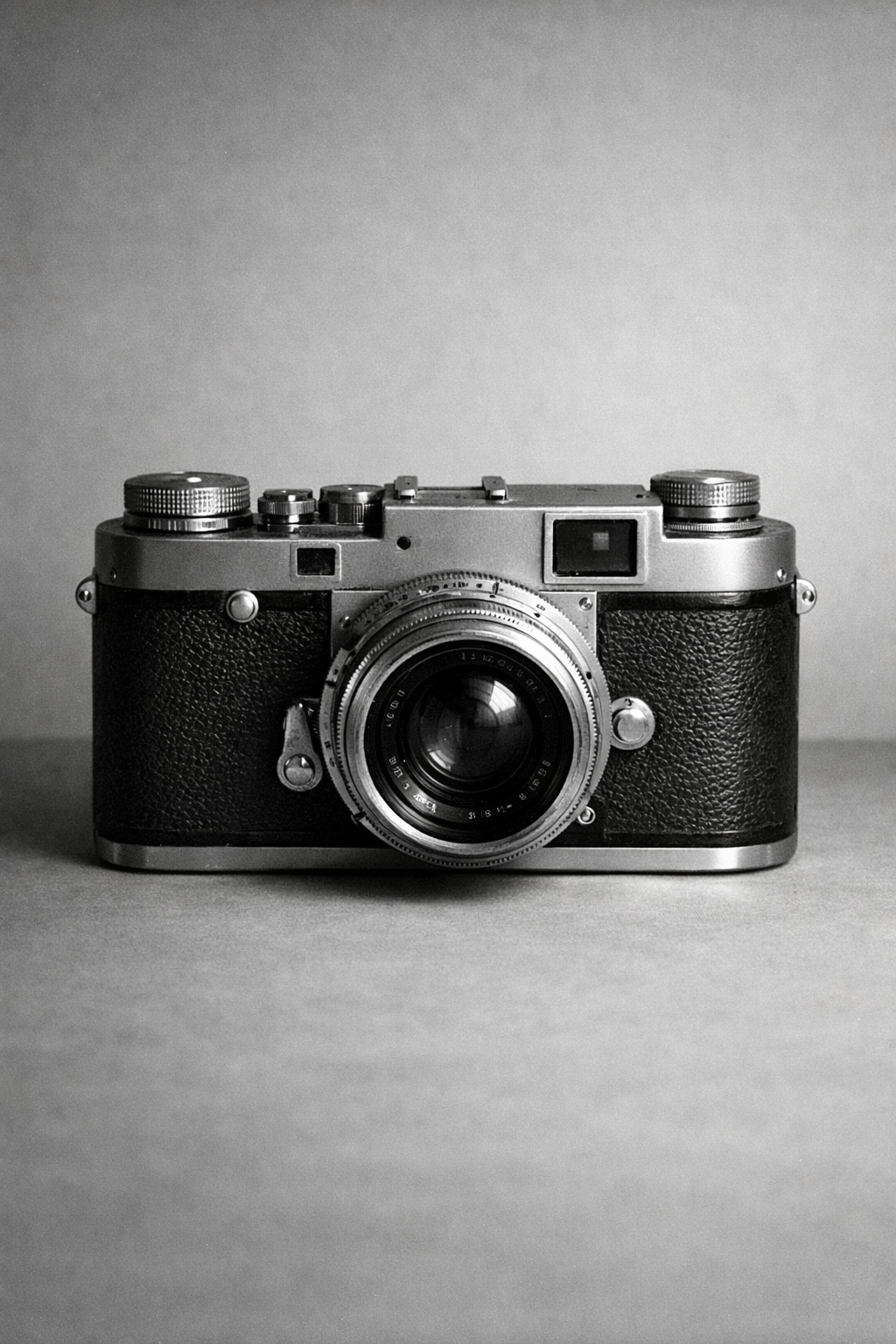
ProseFigure, ProseCaption, and ProseQuote give articles a stronger mid-stream rhythm without breaking away from the shared spacing, border language, and tinted surface hierarchy.
Editorial surfaces should feel authored, not like default markdown with a new font.
import { ProseCaption, ProseFigure, ProseQuote } from "@/components/ui/prose"

<ProseFigure>
  <img
    src="/editorial/archive/rangefinder-camera.png"
    alt="Black and white photograph of a 1950s rangefinder camera."
  />
  <ProseCaption>Caption text and source notes.</ProseCaption>
</ProseFigure>

<ProseQuote>Editorial surfaces should feel authored.</ProseQuote>
Resources And Postscript
Use ProseResources and ProseRule when the article ends with references, release notes, or further reading. That keeps the final section disciplined instead of falling back to an unstructured list.
Longform often ends with references, release notes, or follow-up reading. The prose package includes dedicated pieces for that tail section.
- Launch rationale and design principles
- Implementation notes for the journal templates
- Registry installation and source packages
In Context
Prose becomes more useful when it shares space with other system blocks. In a journal page, the article body can stay readable while adjacent resources and figure strips still feel part of the same product and the surrounding surfaces can step tonally instead of repeating one flat background.
In context
One article system can hold narrative and utilities together.
The prose layer is meant to sit next to product actions, resource lists, and figure strips without collapsing into generic blog markup.
This is where the width variant matters. Use a narrower reading rail for essays, and the default width when the article needs to share the page with adjacent modules.
<Prose width="default">
  <ProseSection>
    <ProseBody>
      <p>Use the wider layout when the article lives beside supporting modules.</p>
    </ProseBody>
  </ProseSection>
</Prose>
Guidance
Pick Width By Layout, Not Taste
- Use
readingfor essay-like pages with a single dominant text rail. - Use
defaultwhen the article needs to coexist with cards, side modules, or editorial blocks. - Use
fullonly when the parent layout already constrains width.
Keep Sections Intentional
ProseHeadershould establish the page's main claim before the body starts.- Break up longform with
ProseSectionrather than stacking arbitrary margins. - Use figures and quotes to support narrative shifts, not as decoration.
Adjust Title Measure With The Page Job
- Use
measure="display"for most article and journal headers. - Move tighter only when the page needs a stronger poster-style claim.
- Move wider when the prose header sits beside supporting modules and needs to read more like a product surface than a cover line.
<ProseHeader>
  <ProseEyebrow>Editorial primitive</ProseEyebrow>
  <ProseTitle measure="display">Product writing can match the interface.</ProseTitle>
  <ProseLead>The prose layer uses the same rhythm as the product UI.</ProseLead>
</ProseHeader>
End The Page Cleanly
- Prefer
ProseResourcesfor curated links, references, or source lists. - Use
ProseRulewhen the final section needs a deliberate reset. - If the content is mostly UI and only includes a paragraph or two, use standard layout primitives instead of the full prose system.
API Reference
Prose
The Prose root renders an article and accepts normal React.ComponentProps<"article"> plus a width variant.
| Prop | Type | Default |
|---|---|---|
width | "default" | "reading" | "full" | "default" |
Exported Slots
| Export | Renders | Notes |
|---|---|---|
ProseHeader | header | Intro block with the strong bottom rule. |
ProseEyebrow | p | Small uppercase label for article type or category. |
ProseTitle | h1 | Primary headline with the system's editorial scale. Accepts measure?: "hero" | "display" | "card" | "panel" | "record" | "fluid". Default: "display". |
ProseLead | p | Lead paragraph directly under the title. |
ProseSection | section | Spaced content section with a top divider. |
ProseBody | div | Body copy wrapper with link, list, and emphasis rules. |
ProseFigure | figure | Framed media block for imagery or diagrams. |
ProseCaption | figcaption | Caption and source text for figures. |
ProseQuote | blockquote | Pull quote or emphasized editorial statement. |
ProseResources | ul | Structured resource list for postscript content. |
ProseRule | hr | Heavy divider used between article phases. |