Card
Surface primitive that keeps standard card imports while adding stronger editorial rhythm.
Copy a concise page brief or the full MDX source without digging through the docs shell.
Card
Keep familiar shadcn card imports while adding more expressive subcomponents.
Cards are the system's repeatable surface for grouped content, metadata, and compact actions. They give docs, settings, and product modules a stable frame without asking each page to rebuild its own spacing and text roles.
Installation
Purchase access, then open /account/install to issue a registry token.Usage
import { Card, CardHeader, CardTitle, CardDescription } from "@/components/ui/card"<Card>
<CardHeader>
<CardTitle measure="card">System Surface</CardTitle>
<CardDescription>Structure before decoration.</CardDescription>
</CardHeader>
</Card>When To Use It
The Swiss card keeps the familiar shadcn import story and adds a stricter internal rhythm. Use it when content needs a visible boundary, a stable title stack, or a predictable action rail.
- Use a card when a section needs a visible frame and repeatable internal spacing.
- Reach for card subcomponents before hand-rolling local title, meta, and footer patterns.
- Change
variantortoneto fit the surface, not to compensate for weak content hierarchy.
Examples
Variant Overview
The base card handles most product UI. The repo-specific variants adjust the surface for denser data panels, editorial modules, or action-heavy tasks.
Default
Use when the card should inherit the page rhythm.
Data
Lets nested metrics and filters read clearly.
Action
Useful when buttons and metadata live together.
default: General docs, settings, and neutral product surfaces.editorial: Story-led modules where type and spacing should carry more authority.data: Denser dashboards or metrics panels with a lower visual temperature.form: Input-heavy sections that need a stable task frame.media: Cards with a dedicated media rail or image region.action: Prompt surfaces where the footer or CTA cluster is the main outcome.
Composition With Media And Actions
The exported subcomponents are meant to combine. CardMedia, CardPrice, and CardActions let a catalog or launch card stay inside the same primitive.
Commerce composition
The card stays usable on a catalog shelf without drifting into a separate layout pattern.
import {
Card,
CardActions,
CardContent,
CardHeader,
CardMedia,
CardPrice,
CardTitle,
} from "@/components/ui/card"
import { Button } from "@/components/ui/button"
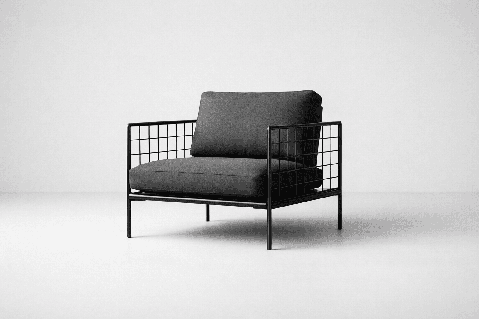
<Card variant="media">
<CardMedia />
<CardHeader>
<CardTitle>Grid Chair</CardTitle>
</CardHeader>
<CardContent>
<CardPrice>$420</CardPrice>
<CardActions>
<Button>Add to cart</Button>
<Button variant="outline">See details</Button>
</CardActions>
</CardContent>
</Card>In Context
Cards are most convincing when they show relationship, not isolation. Pair a lead card with a quieter support panel so the layout keeps hierarchy without repeating the same silhouette.
Launch note
One card can hold the story summary while the footer collects the next move.
Supporting metrics
<Card variant="data" tone="hero">
  <CardHeader>
    <CardTitle>Supporting metrics</CardTitle>
  </CardHeader>
  <CardContent>{/* compact metrics or filters */}</CardContent>
</Card>
Guidance
Start With Content Structure
- Use
CardHeaderfor identity, not just decoration. - Keep
CardTitleshort enough to hold an intentional line length. - Put metadata in
CardMetaorCardEyebrowso the title can stay focused on the main idea.
Control Title Measure By Role
- Use
measure="card"for the default card headline. - Move to
measure="panel"when the title is longer or reads more like support copy. - Use
measure="display"when the card needs more editorial emphasis. - Keep
fluidrare. Most cards benefit from an authored measure.
<CardHeader>
  <CardTitle measure="panel">Pricing decisions, stated clearly.</CardTitle>
  <CardDescription>Wider support titles keep dense cards from collapsing into one repeated silhouette.</CardDescription>
</CardHeader>
Choose Variant Before Tone
- Pick
variantbased on the kind of surface you are building. - Use
tone="quiet"ortone="hero"as a secondary adjustment after the structure is right. - Reserve
tone="inverse"for genuinely dark or image-heavy environments.
Prefer Reuse Over One-Off Layouts
- If a card needs pricing, actions, or media, use the exported slots before creating a custom wrapper.
- Keep footer actions concise; a card is a container, not a full page.
- When content can sit directly on the page without losing clarity, skip the card entirely.
API Reference
Card
The root Card component renders a div and accepts standard React.ComponentProps<"div"> plus the shared surface variants below.
variant:"default" | "editorial" | "data" | "form" | "media" | "action". Default:"default".tone:"default" | "quiet" | "hero" | "inverse". Default:"default".
Exported Slots
Use the slot components to keep hierarchy consistent instead of re-creating local typography rules.
CardHeaderrenders adiv. Use it for the title stack and the default top divider.CardTitlerenders adiv. Use it for the main card headline. It also acceptsmeasure?: "hero" | "display" | "card" | "panel" | "record" | "fluid". Default:"card".CardDescriptionrenders ap. Use it for supporting context.CardEyebrowrenders ap. Use it for category, state, or small labels.CardMetarenders adiv. Use it for compact metadata such as tags, dates, or attributes.CardContentrenders adiv. Use it for the main body area.CardFooterrenders adiv. Use it for the bottom action rail.CardActionrenders adiv. Use it for a small action cluster inside the header.CardActionsrenders adiv. Use it for grouped actions inside the content area.CardPricerenders adiv. Use it for price or numeric emphasis.CardMediarenders adiv. Use it for a framed media region with the default aspect ratio.