Product Card Split
Split-layout commerce block that balances media presence with structured product metadata.
Copy a concise page brief or the full MDX source without digging through the docs shell.
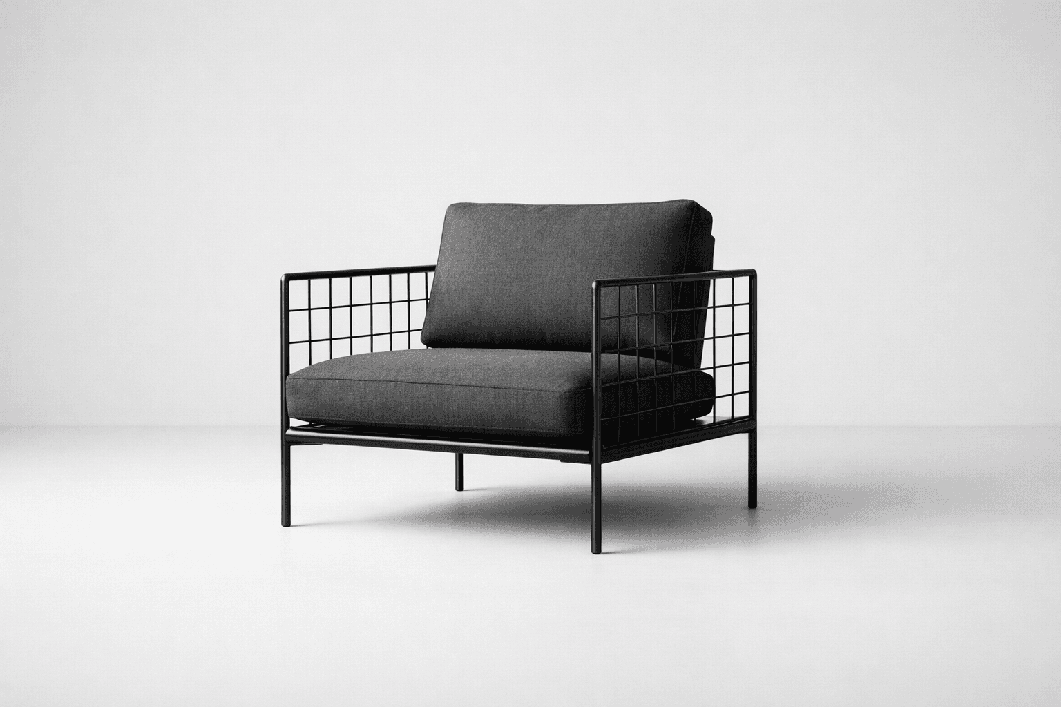
Specification / Seating
Useful when a product needs a visual rail and a denser specification column. The split keeps attributes, price, and actions in a predictable order.
ProductCardSplit is a structured commerce block for product moments that need more metadata than an overlay card can comfortably hold. It balances a defined media rail with a content column for title, attributes, price, and follow-up actions.
Installation
Purchase access, then open /account/install to issue a registry token.Usage
import { ProductCardSplit } from "@/registry/swiss/blocks/product-card-split"<ProductCardSplit
eyebrow="Specification / Seating"
title="Grid Back Lounge"
meta={["Modular", "Indoor", "1980 mm"]}
description="Useful when a product needs a visual rail and a denser specification column. The split keeps attributes, price, and actions in a predictable order."
price="$2,240"
primaryAction={{ label: "Configure" }}
secondaryAction={{ label: "View dimensions", variant: "catalog" }}
/>Why This Block Exists
Not every featured product wants a campaign-style overlay. This block gives merchandising and specification views a clearer two-column structure for attributes, price, and next actions.
- Use it when merchandising needs both image presence and readable metadata.
- Prefer it to a plain card when the product attributes deserve their own structured rail.
- Choose the overlay block instead when art direction and contrast are more important than spec density.
Examples
Default Split Layout
The base block divides attention between media and structured product information.
Specification / Seating
Useful when a product needs a visual rail and a denser specification column. The split keeps attributes, price, and actions in a predictable order.
<ProductCardSplit />Related Commerce Composition
The same split structure works across launch shelves, specification views, and richer product decision surfaces.
Lighting / Architectural
Designed for launch moments where one object carries the section. Price, category, and action remain legible under a high-contrast overlay.
In Context
This block works well in a launch shelf or editorial feature where one product needs more detail than the supporting items around it.
Project / Seating
A structured product block for procurement and specification views where image presence matters but the buying decision still depends on readable metadata.
Decision support
The structure fits specification pages, project pricing flows, and richer product shelves where dimensions, finish notes, or configuration status matter.
Guidance
Use It When Metadata Matters
- The split layout is strong when dimensions, tags, or attribute chips affect the buying decision.
- Keep the supporting paragraph concise so the metadata remains scannable.
- If the product story is purely atmospheric, the overlay block may be a better fit.
Preserve The Two-Column Rhythm
- Let the media rail stay visually simple.
- Keep the content side structured with title, meta, copy, price, then actions.
- Avoid adding long body text that turns the block into a full editorial article.
Treat It As A Prebuilt Pattern
- Use the content props to match the object, price, and decision flow in the parent surface.
- Keep the media side visually simple so the specification column can stay legible.
- Reuse the same order of information instead of reassembling the split card for each product family.
API Reference
ProductCardSplit
ProductCardSplit exposes content props for one media-and-metadata product surface.
| Prop | Type | Required | Notes |
|---|---|---|---|
eyebrow | string | no | Product category or surface label. |
title | string | no | Primary product name. |
meta | string[] | no | Short attribute list. |
description | string | no | Supporting commercial copy. |
price | string | no | Main price emphasis. |
primaryAction | { label: string; href?: string; variant?: ... } | no | Primary next step. |
secondaryAction | { label: string; href?: string; variant?: ... } | no | Secondary supporting action. |
mediaClassName | string | no | Optional media rail treatment override. |
media | ReactNode | no | Optional custom media content. |
image | { src: string; alt: string } | no | Optional image override when not using media. |
Composition Notes
| Internal structure | Role |
|---|---|
Card with variant="media" | Defines the split outer surface and border rhythm. |
CardMedia | Provides the dedicated visual rail. |
CardHeader with CardEyebrow, CardTitle, and CardMeta | Holds product identity and attributes. |
CardContent | Carries supporting copy, price, and actions. |
CardActions | Supports one primary and one secondary next step. |