Journal / 01
History, Order, And The Postwar Need For Clarity
How Swiss International Style turned modernist impulses into a repeatable communication system.
Postwar EuropeBasel + ZurichDesign systems before software
Swiss Journal / Reading Register
Essays, case studies, and source material for the editorial layer behind the edition.
The journal explains the system, then shows it under real publishing and product-facing use. The first screen stays compact so the reading sequence starts immediately.
How Swiss International Style turned modernist impulses into a repeatable communication system.
Historical context, structure studies, and product-facing specimens.
Archives, institutions, and web translations kept in one reading rail.
Shared editorial figures used across cards, rails, and longform pages.
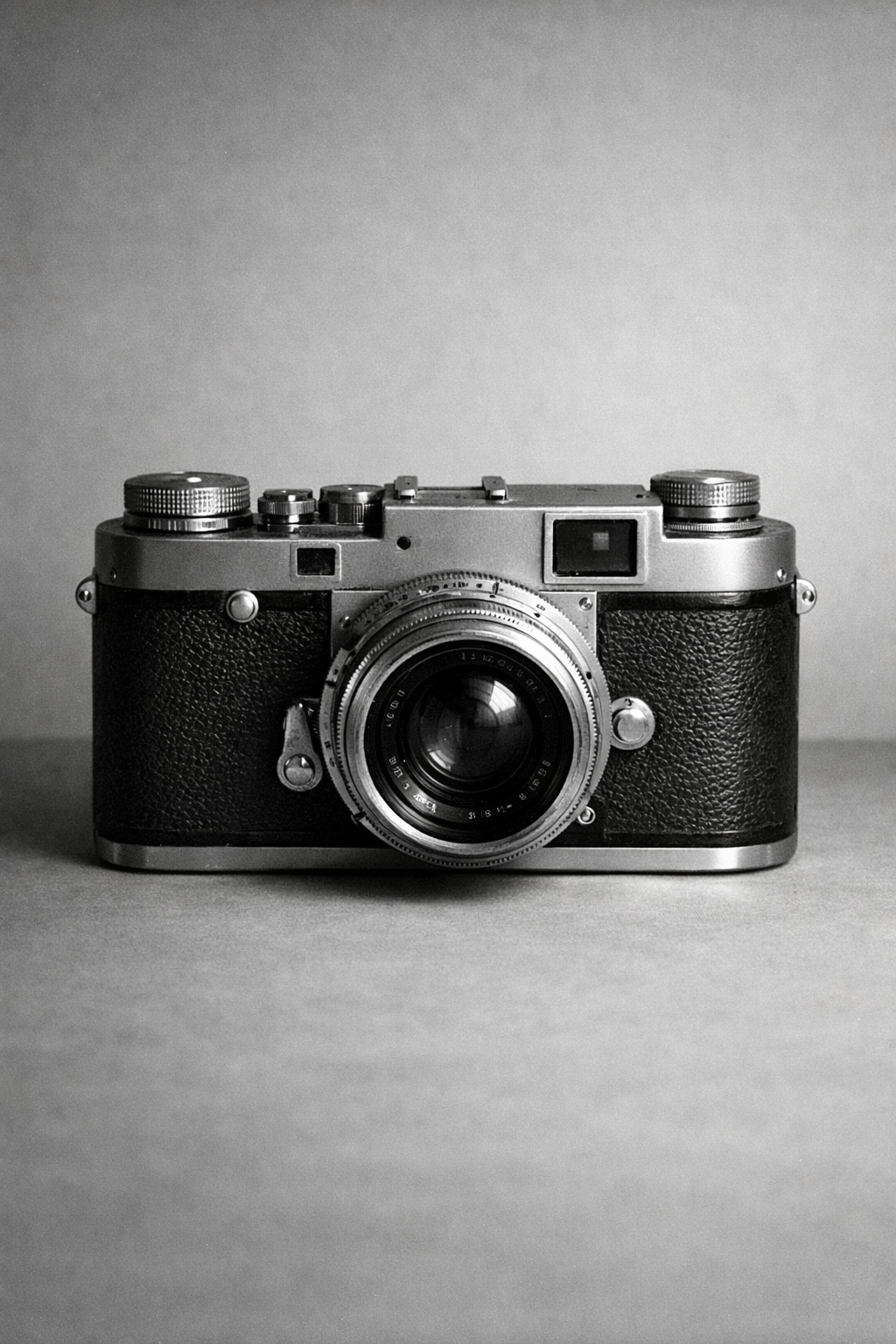
A mid-century rangefinder camera resting on a plain table. The hard edges and familiar silhouette keep the editorial surface exact without turning decorative.
Familiar hardware. Hard edges. Enough detail to prove crop behavior without taking over the page.
Page method
The opening reading starts with postwar communication needs, then shows how that logic translates into interface structure.
The page keeps article metadata, reading time cues, and source links close to the prose instead of treating the journal like a moodboard.
The same photographic set carries the index, article pages, and docs examples so the editorial layer feels authored under reuse.
Reading register
Each entry keeps the topic, role, and context visible before you open it. That makes the index read like a working register rather than a pile of cards.
How Swiss International Style turned modernist impulses into a repeatable communication system.
Why grid, type, and spacing matter more than Swiss surface cues.
A product-style launch note that shows the prose system on real release content.
A realistic editorial case study showing how the theme carries product-facing analysis.
Photographic studies
A shared black and white source set keeps the journal, docs, and examples anchored to the same image language.
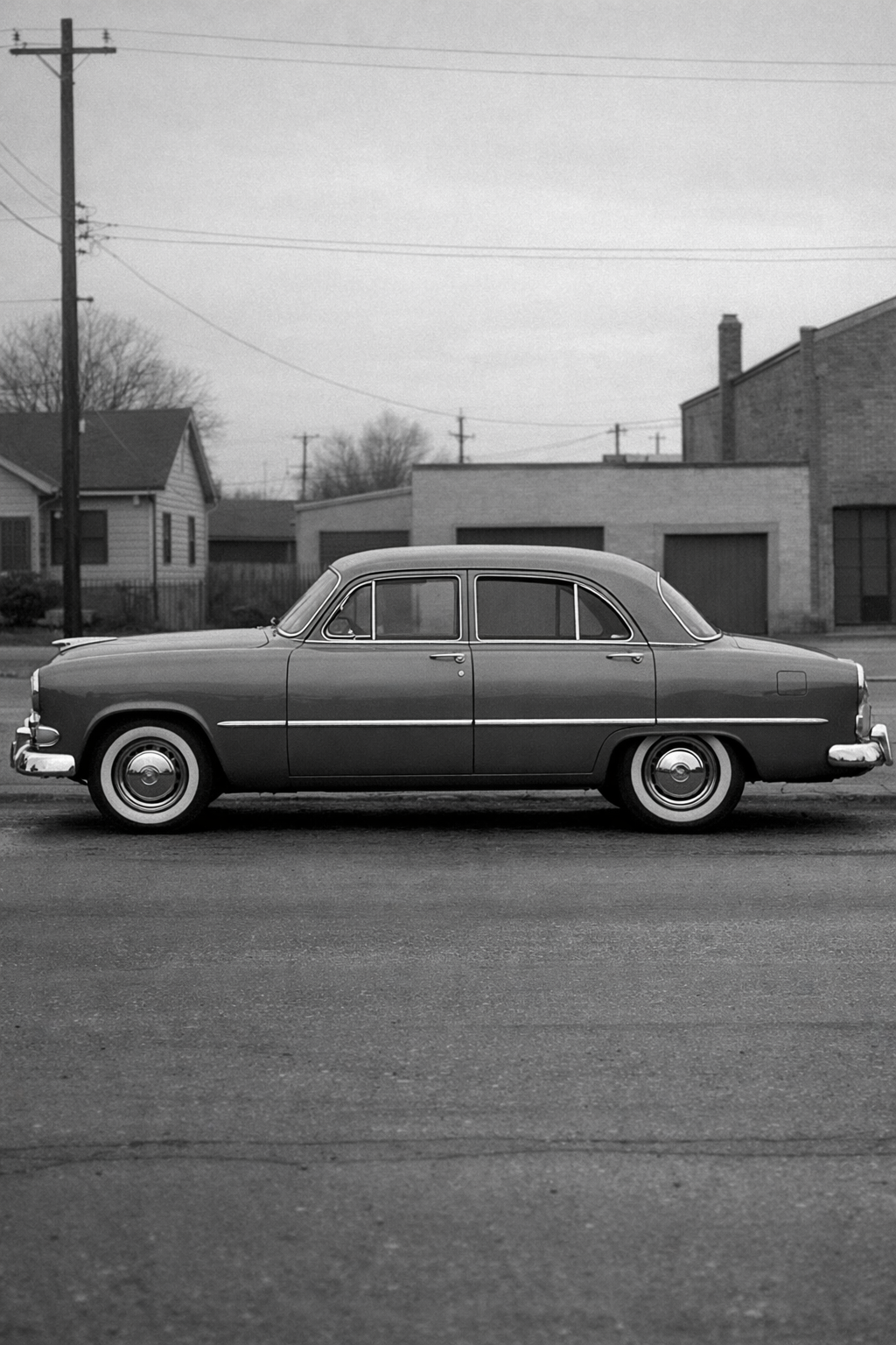
A sedan profile gives wide crops real structure. The form is simple enough to hold a card or hero without drifting into generic stock imagery.
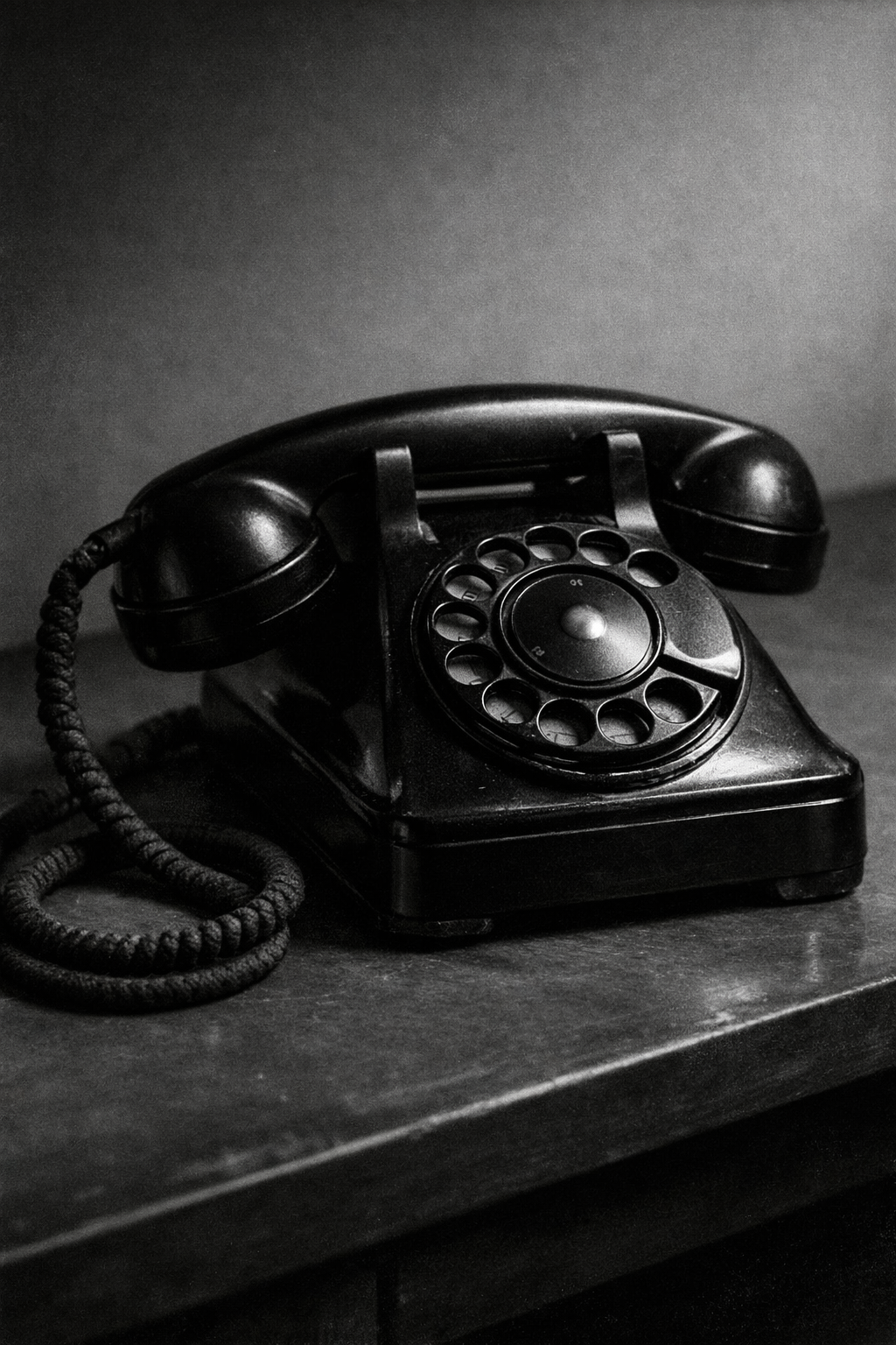
The telephone keeps the composition direct. The handset, dial, and cord give smaller frames enough detail without making them noisy.
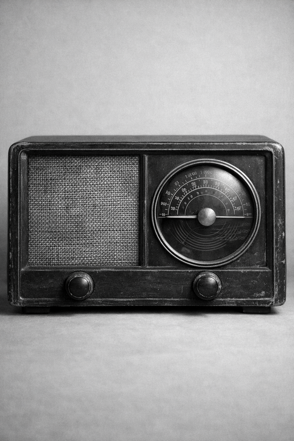
The radio reads well when the layout needs a denser still life. Its grille and controls keep the surface active while staying orderly.
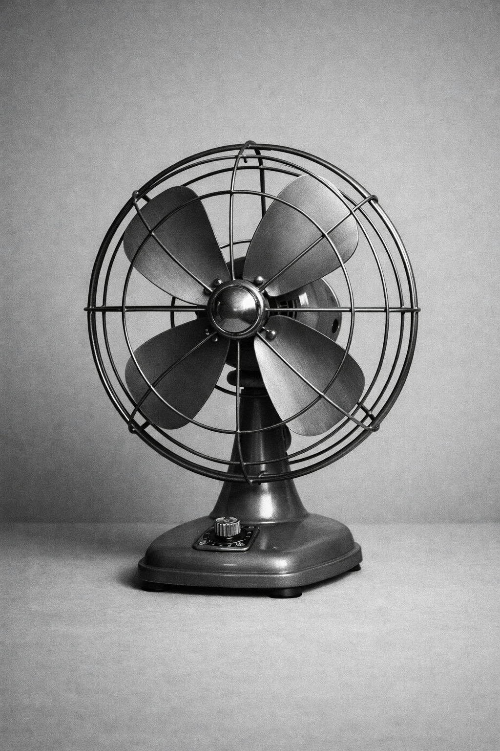
The desk fan gives wide frames a clear rhythm. Repeated metal lines make it useful anywhere the layout wants calm motion without illustration.
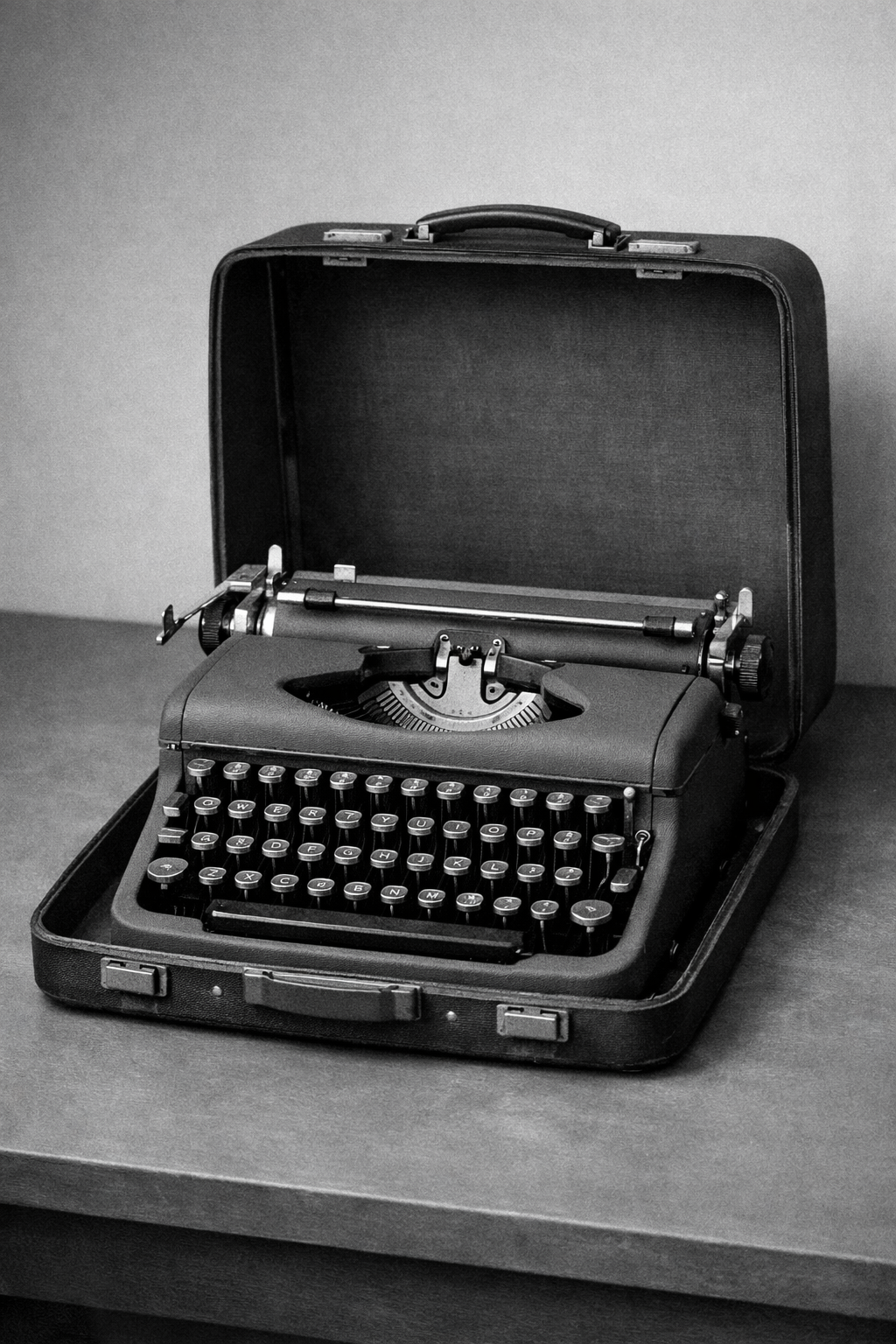
The typewriter has enough mechanical detail to support tighter editorial crops. It feels authored and product-facing instead of decorative.
The camera works as the journal anchor because it is plain, exact, and familiar. It reads as editorial evidence rather than a filler image.
Reference library
Archives, institutions, and bridge texts that support the historical frame and the interface argument.
Best single visual explainer for why grids became the operating system of Swiss poster design.
Primary-source poster browsing for rhythm, crop behavior, and hierarchy under real cultural commissions.
Useful for canonical validation and for seeing how Swiss work entered the modern design canon.
Strong source for book and poster documentation tied to Swiss pedagogy and print culture.
Practical artifact-level references for how grotesks, spacing, and hierarchy were actually combined.
A helpful bridge article for translating Swiss visual priorities into usable web design decisions.
A practical, interface-oriented read on why reduction, grids, and typographic hierarchy still work online.
A direct source for studying neutrality, scale transitions, and typographic color.
Useful for understanding why Swiss systems care about families, numbering, and disciplined variation.
Good for studying contrast, interval, and the teaching lineage behind Basel-era Swiss design.