Journal / 02
Structure Before Styling
Why grid, type, and spacing matter more than Swiss surface cues.
Grid logicType hierarchyProduct translation
Journal / 04
A realistic editorial case study showing how the theme carries product-facing analysis.
A Swiss-influenced theme earns its place when it can hold dense product reasoning, not only visual inspiration. This case study uses the prose layer the way a design team might document an interface decision.
A compact sequence with one structural idea per stop.
Direct sources kept close to the argument.
Follow-on readings drawn from the same authored set.
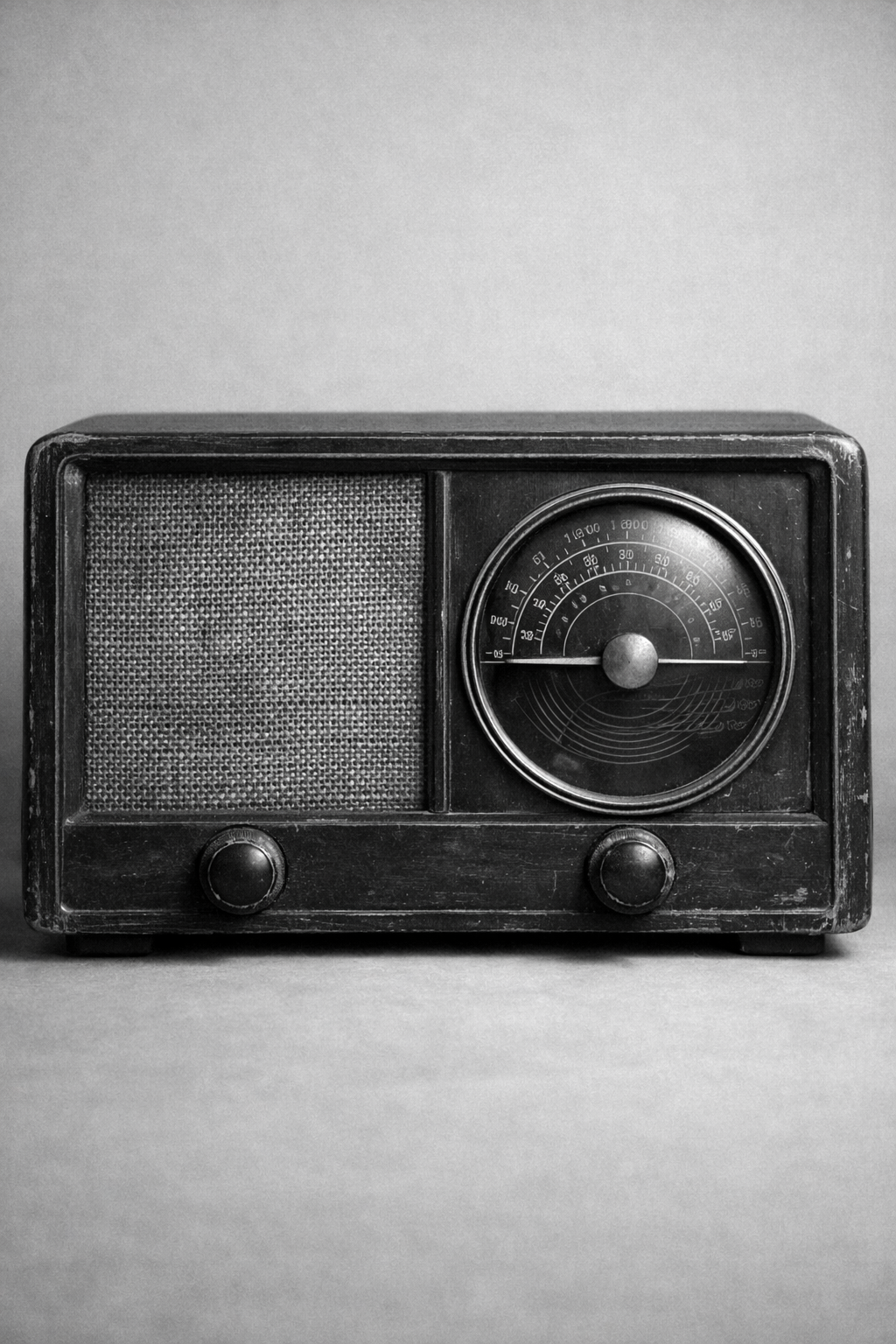
A tabletop radio viewed straight on. The grille, dial, and cabinet give the journal and docs a quieter still-life object with clear mechanical detail.
Editorial and application surfaces should share one structural grammar.
Dense product reasoning should remain readable without softer styling.
Reading sequence
The reference product surface was an operations register with dense rows, long labels, and frequent status changes. Earlier drafts relied on rounded cards, soft elevation, and multiple accent colors to separate information.
The revised version reduced the number of visual devices. Borders became structural. Accent color became rare. Typography took over category, priority, and section labeling. Empty space was measured instead of simply increased.
A case study like this needs disciplined section rhythm, callouts, references, and supporting figures. The prose layer keeps that material readable without switching to a different visual language.
Journal / 04 / 01
The reference product surface was an operations register with dense rows, long labels, and frequent status changes. Earlier drafts relied on rounded cards, soft elevation, and multiple accent colors to separate information.
The result looked friendly at first glance, but row rhythm collapsed under load. Priority, status, and navigation all competed for attention.
Journal / 04 / 02
The revised version reduced the number of visual devices. Borders became structural. Accent color became rare. Typography took over category, priority, and section labeling. Empty space was measured instead of simply increased.
That changed the tone of the interface immediately. The surface felt more exact, and dense views became easier to scan without adding more decoration.
Journal / 04 / 03
A case study like this needs disciplined section rhythm, callouts, references, and supporting figures. The prose layer keeps that material readable without switching to a different visual language.
That is the useful proof. The same theme can support an interface, the explanation of that interface, and the commercial surfaces around it.
Photographic strip
Shared editorial figures keep the reading surface grounded in the same image language as the wider journal.
The radio reads well when the layout needs a denser still life. Its grille and controls keep the surface active while staying orderly.
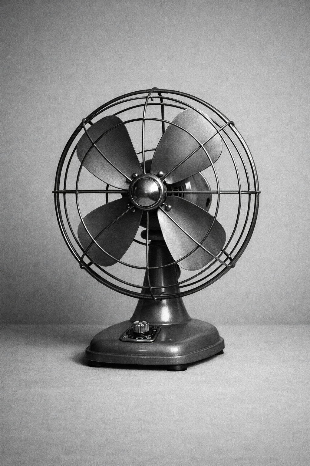
The desk fan gives wide frames a clear rhythm. Repeated metal lines make it useful anywhere the layout wants calm motion without illustration.
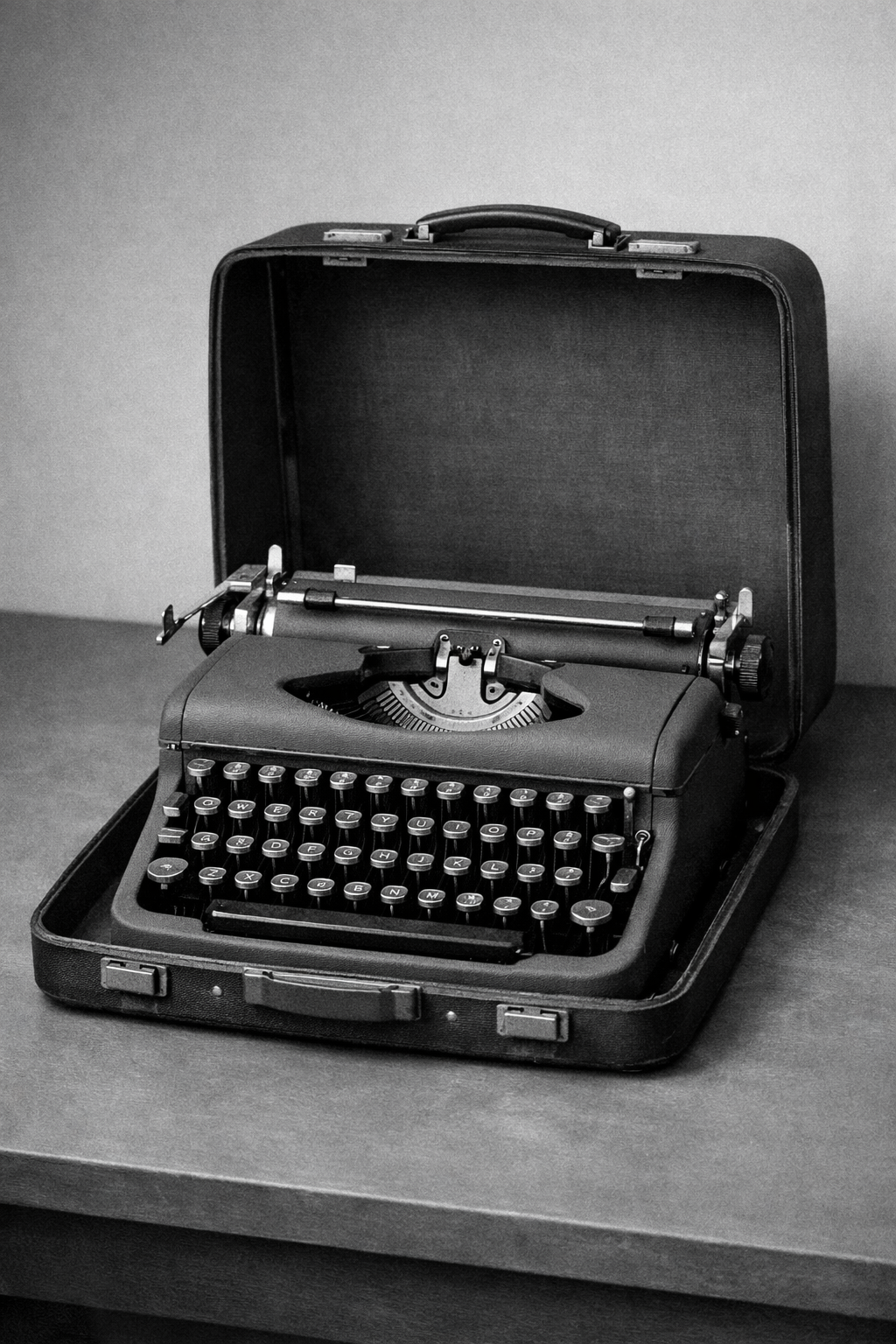
The typewriter has enough mechanical detail to support tighter editorial crops. It feels authored and product-facing instead of decorative.
Selected references
Primary references and bridge texts kept close to the article rather than moved into a generic footer rail.
Practical artifact-level references for how grotesks, spacing, and hierarchy were actually combined.
A helpful bridge article for translating Swiss visual priorities into usable web design decisions.
A practical, interface-oriented read on why reduction, grids, and typographic hierarchy still work online.
Next reading
Why grid, type, and spacing matter more than Swiss surface cues.
A product-style launch note that shows the prose system on real release content.