Journal / 02
Structure Before Styling
Why grid, type, and spacing matter more than Swiss surface cues.
Grid logicType hierarchyProduct translation
Journal / 01
How Swiss International Style turned modernist impulses into a repeatable communication system.
Swiss International Style lasted because it made clarity repeatable. Earlier modernist ideas became a disciplined method for signage, publishing, and public communication under real institutional pressure.
A compact sequence with one structural idea per stop.
Direct sources kept close to the argument.
Follow-on readings drawn from the same authored set.
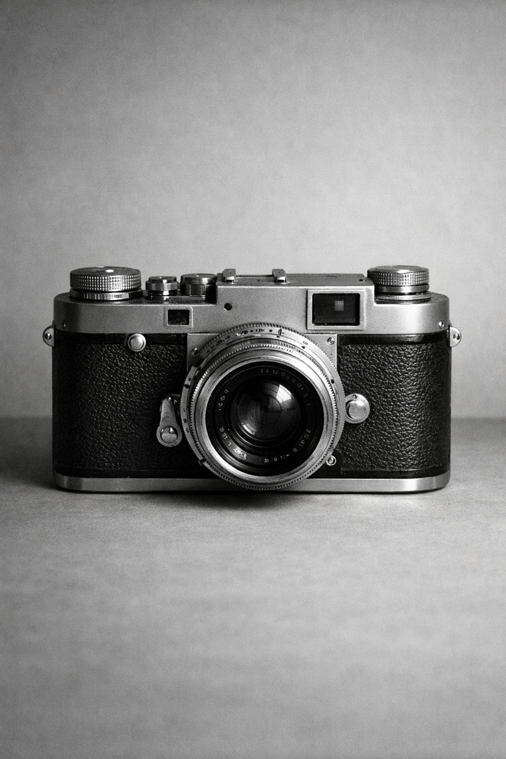
A mid-century rangefinder camera resting on a plain table. The hard edges and familiar silhouette keep the editorial surface exact without turning decorative.
Type hierarchy should carry meaning before decoration appears.
Structural rules and spacing are treated as first-class product decisions.
Reading sequence
Swiss International Style formed in the 1940s and 1950s, but its force came from what it rejected. Decorative commercial graphics and nationally coded visual rhetoric looked ill-suited to a postwar world that needed legibility, trust, and shared public language.
The Swiss contribution was not inventing modernism from nothing. It was systematizing it. Ernst Keller's teaching pushed designers toward solutions derived from content, while Basel sharpened the relationship between type, interval, and structure.
The useful inheritance is not nostalgia. It is the idea that hierarchy should emerge from content and structure. Headings, labels, spacing, and rules should explain the interface before color or motion gets involved.
Journal / 01 / 01
Swiss International Style formed in the 1940s and 1950s, but its force came from what it rejected. Decorative commercial graphics and nationally coded visual rhetoric looked ill-suited to a postwar world that needed legibility, trust, and shared public language.
Designers in Zurich and Basel consolidated earlier modernist ideas into a method. The method mattered more than any one poster. It could support signage, publishing, and corporate communication without changing its underlying logic every time the context shifted.
The lasting contribution was not a look. It was a disciplined way to make information readable.
Swiss International Style, reframed for product UI
Journal / 01 / 02
The Swiss contribution was not inventing modernism from nothing. It was systematizing it. Ernst Keller's teaching pushed designers toward solutions derived from content, while Basel sharpened the relationship between type, interval, and structure.
That teaching lineage still matters because software has the same problem at larger scale. Teams need repeatable decisions, not isolated moments of taste.
Journal / 01 / 03
The useful inheritance is not nostalgia. It is the idea that hierarchy should emerge from content and structure. Headings, labels, spacing, and rules should explain the interface before color or motion gets involved.
That is why this theme stays hard-edged and sparse. The aim is not vintage reference. The aim is an information system that reads as deliberate under real product content.
Photographic strip
Shared editorial figures keep the reading surface grounded in the same image language as the wider journal.
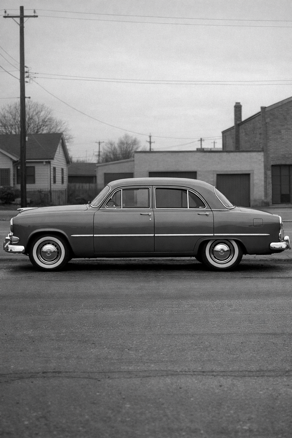
A sedan profile gives wide crops real structure. The form is simple enough to hold a card or hero without drifting into generic stock imagery.
The camera works as the journal anchor because it is plain, exact, and familiar. It reads as editorial evidence rather than a filler image.
Selected references
Primary references and bridge texts kept close to the article rather than moved into a generic footer rail.
Best single visual explainer for why grids became the operating system of Swiss poster design.
Primary-source poster browsing for rhythm, crop behavior, and hierarchy under real cultural commissions.
Useful for canonical validation and for seeing how Swiss work entered the modern design canon.
Next reading
Why grid, type, and spacing matter more than Swiss surface cues.
A product-style launch note that shows the prose system on real release content.