Journal / 01
History, Order, And The Postwar Need For Clarity
How Swiss International Style turned modernist impulses into a repeatable communication system.
Postwar EuropeBasel + ZurichDesign systems before software
Journal / 02
Why grid, type, and spacing matter more than Swiss surface cues.
The strongest Swiss interfaces do not start with poster references. They start with rails, measures, type roles, and enough reduction for hierarchy to stay intact under changing content.
A compact sequence with one structural idea per stop.
Direct sources kept close to the argument.
Follow-on readings drawn from the same authored set.
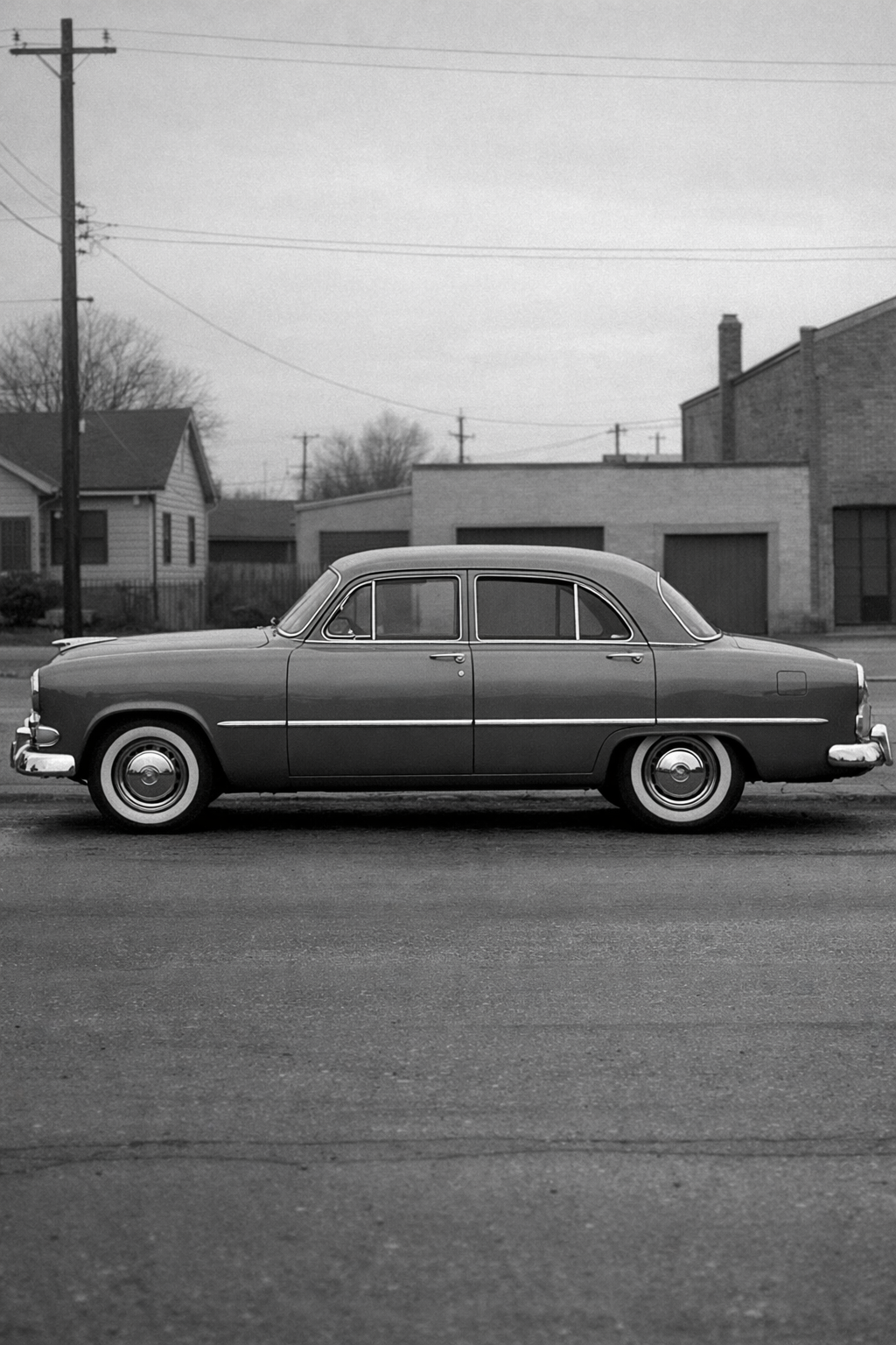
A 1950s family sedan shown in side profile on a quiet street. The long body line gives wide crops a calm structure that still feels grounded in a real object.
Grid and type decisions should be visible in the page rhythm, not hidden behind decorative styling.
Asymmetry works only when the support structure remains legible.
Reading sequence
A Swiss composition rarely feels arbitrary because every element behaves as part of one measured field. Lines, captions, images, and empty space all answer to the same structure.
Swiss design is often reduced to Helvetica, but the deeper lesson is structural typography. Families, weights, labels, intervals, and measure establish reading order before any decorative layer appears.
A serious translation of Swiss design into UI means fewer stylistic gestures and more explicit structure. Shared edges. Crisp dividers. Sparse accent use. Text roles that hold together across marketing pages and application screens.
Journal / 02 / 01
A Swiss composition rarely feels arbitrary because every element behaves as part of one measured field. Lines, captions, images, and empty space all answer to the same structure.
On the web, that becomes column systems, section wrappers, headline measures, and repeatable gutters. The result is not only consistency. It is confidence under reuse.
Journal / 02 / 02
Swiss design is often reduced to Helvetica, but the deeper lesson is structural typography. Families, weights, labels, intervals, and measure establish reading order before any decorative layer appears.
That matters in product UI because dense tables, forms, and navigation surfaces fail first at hierarchy. If type roles are resolved, the interface can stay restrained without becoming vague.
Journal / 02 / 03
A serious translation of Swiss design into UI means fewer stylistic gestures and more explicit structure. Shared edges. Crisp dividers. Sparse accent use. Text roles that hold together across marketing pages and application screens.
That is where the value lives. The system stays authored because the rules survive new content.
Photographic strip
Shared editorial figures keep the reading surface grounded in the same image language as the wider journal.
A sedan profile gives wide crops real structure. The form is simple enough to hold a card or hero without drifting into generic stock imagery.
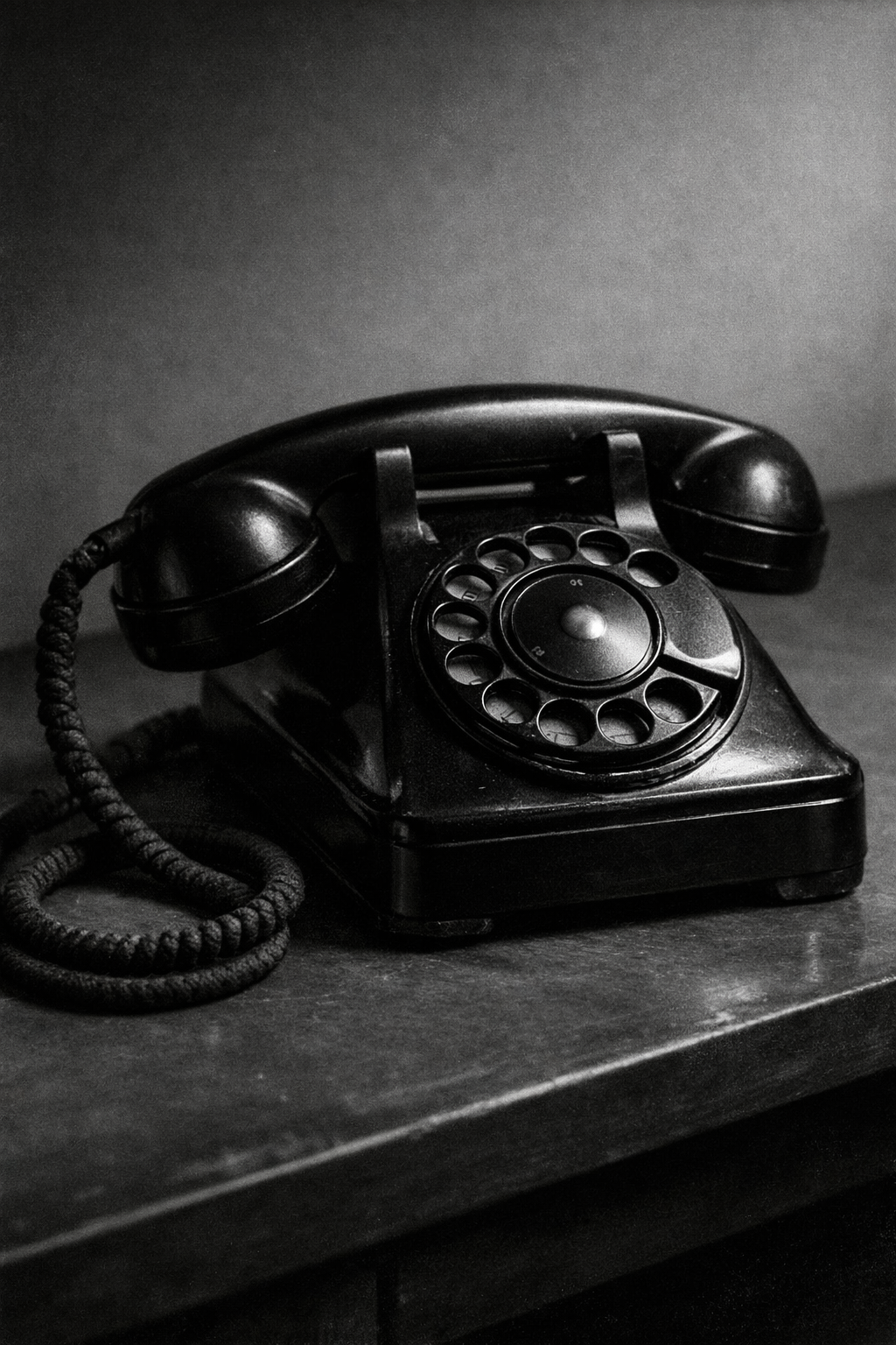
The telephone keeps the composition direct. The handset, dial, and cord give smaller frames enough detail without making them noisy.
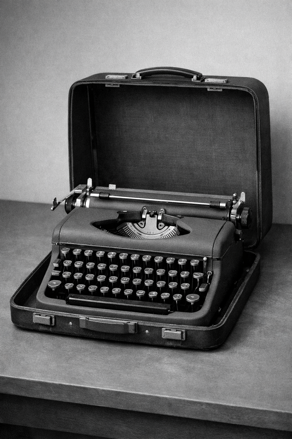
The typewriter has enough mechanical detail to support tighter editorial crops. It feels authored and product-facing instead of decorative.
Selected references
Primary references and bridge texts kept close to the article rather than moved into a generic footer rail.
Best single visual explainer for why grids became the operating system of Swiss poster design.
A practical, interface-oriented read on why reduction, grids, and typographic hierarchy still work online.
Useful for understanding why Swiss systems care about families, numbering, and disciplined variation.
Next reading
How Swiss International Style turned modernist impulses into a repeatable communication system.
A realistic editorial case study showing how the theme carries product-facing analysis.