Journal / 02
Structure Before Styling
Why grid, type, and spacing matter more than Swiss surface cues.
Grid logicType hierarchyProduct translation
Journal / 03
A product-style launch note that shows the prose system on real release content.
This release adds the editorial layer to the registry. Longform pages now use the same typographic hierarchy, spacing rules, and structural dividers as the rest of the system.
A compact sequence with one structural idea per stop.
Direct sources kept close to the argument.
Follow-on readings drawn from the same authored set.
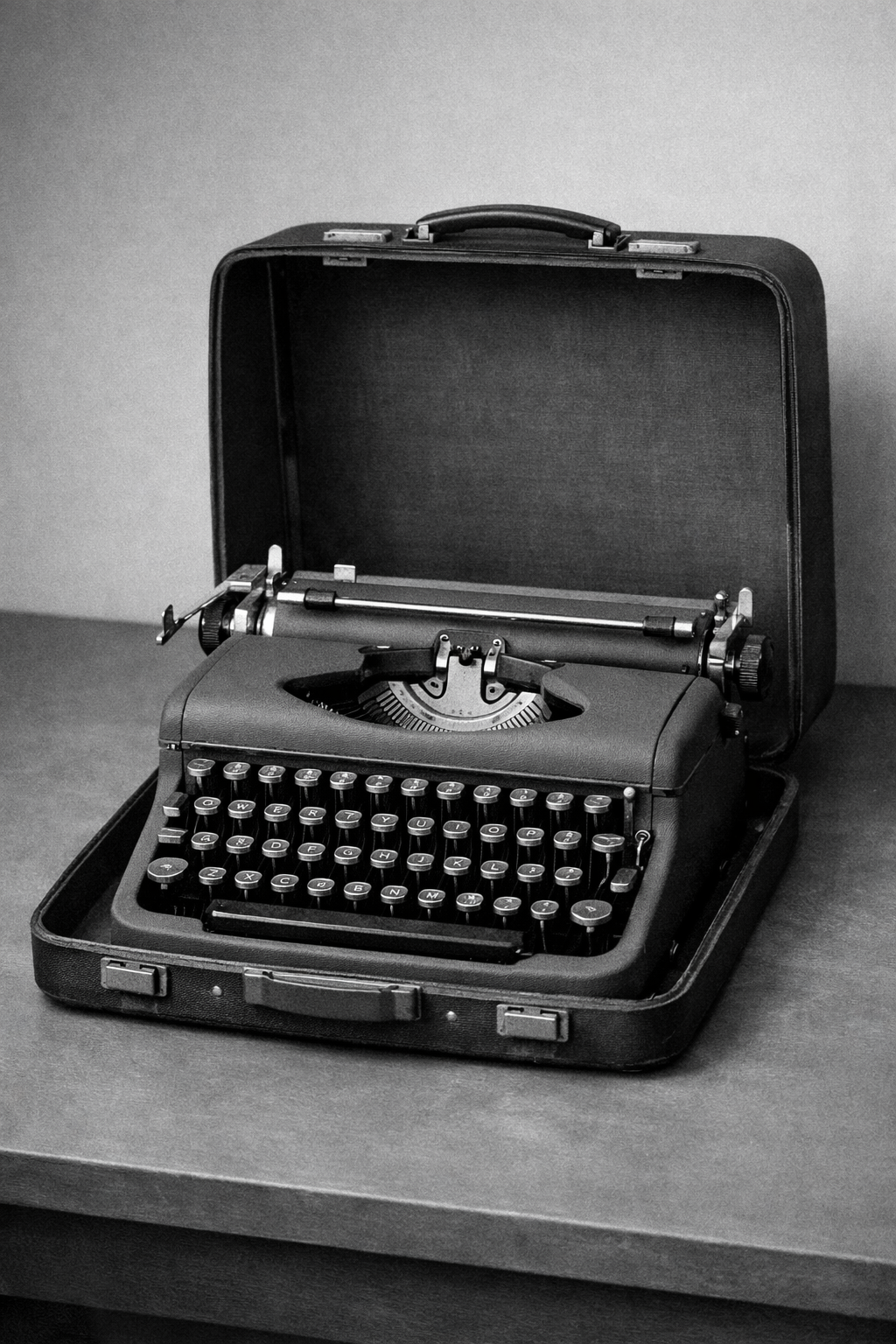
A portable typewriter opened on a table. The keys and carriage create a sharper longform figure that reads as evidence instead of filler.
The prose layer should feel shipped, not custom-built for one page.
Release content can use the same structural grammar as product UI.
Reading sequence
The registry now includes prose primitives and editorial blocks for longform publishing. Article headers, section rails, figure treatments, pull quotes, resource lists, and article cards all follow the same structural language as the component set.
Longform content shapes product perception as much as the application shell does. Release notes, feature pages, and documentation often carry the first serious explanation of what a product is.
The headline measure stays narrow. Section titles do the navigation work. Figures, references, and adjacent modules keep the same borders and tonal steps as the application surfaces.
Journal / 03 / 01
The registry now includes prose primitives and editorial blocks for longform publishing. Article headers, section rails, figure treatments, pull quotes, resource lists, and article cards all follow the same structural language as the component set.
That closes an obvious gap in many UI libraries. Product teams can now publish launch notes, essays, case studies, and docs pages without dropping into generic markdown defaults.
Journal / 03 / 02
Longform content shapes product perception as much as the application shell does. Release notes, feature pages, and documentation often carry the first serious explanation of what a product is.
When those surfaces fall back to generic prose, the brand fractures. A coherent editorial layer keeps the product standard intact across reading contexts.
Journal / 03 / 03
The headline measure stays narrow. Section titles do the navigation work. Figures, references, and adjacent modules keep the same borders and tonal steps as the application surfaces.
That consistency is the point of the release. The page reads as part of the product, not as a disconnected marketing template.
Photographic strip
Shared editorial figures keep the reading surface grounded in the same image language as the wider journal.

The telephone keeps the composition direct. The handset, dial, and cord give smaller frames enough detail without making them noisy.
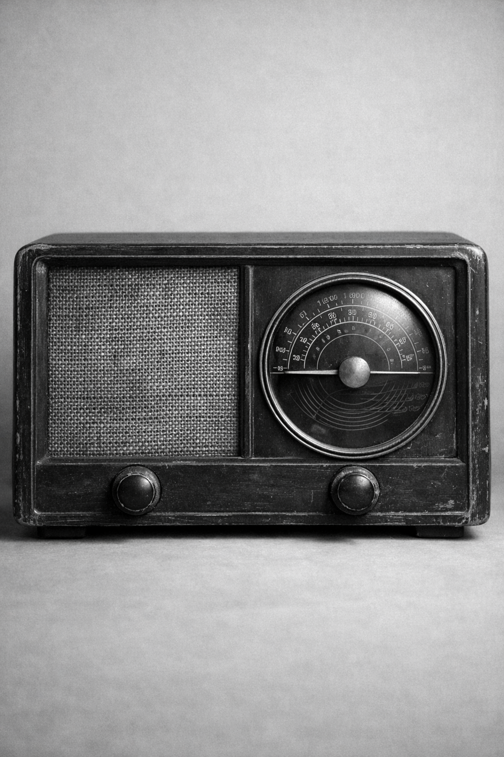
The radio reads well when the layout needs a denser still life. Its grille and controls keep the surface active while staying orderly.
Selected references
Primary references and bridge texts kept close to the article rather than moved into a generic footer rail.
A direct source for studying neutrality, scale transitions, and typographic color.
Useful for understanding why Swiss systems care about families, numbering, and disciplined variation.
Next reading
Why grid, type, and spacing matter more than Swiss surface cues.
A realistic editorial case study showing how the theme carries product-facing analysis.